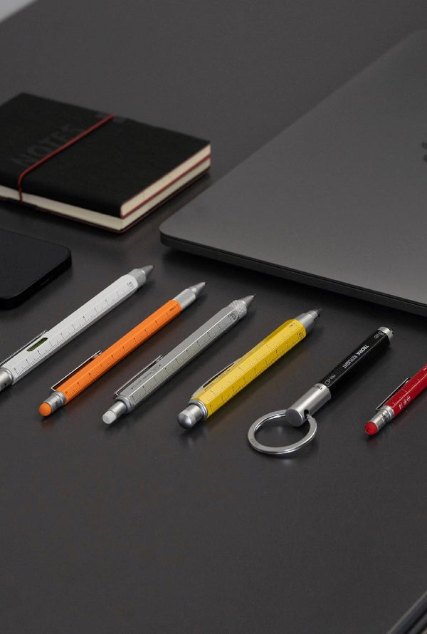
TARIF FORFAIT D'EXPÉDITION DE 6,90 $ - LIVRAISON GRATUITE SUR TOUTES LES COMMANDES DE PLUS DE 100 $

0

Votre panier est vide

Boutique
  • Troika Canada Gifts
  • TROIKA Canada Adopts New Global Brand Identity

    TROIKA Canada new logo with maple leaf — updated brand identity 2026

    A New Logo for a New Chapter

    TROIKA Canada is proud to officially introduce our updated logo and brand identity, aligning ourselves with the new global visual direction defined by our German headquarters.

    This change marks an important milestone in our brand evolution and reflects a unified international identity across all markets where TROIKA is present.

    For Canada, this means more than a visual refresh—it is a clear statement that we are fully integrated into TROIKA’s global brand family while also strengthening our uniquely Canadian identity.

    A Direct Link to Germany’s New Brand Direction

    Our new TROIKA Canada logo has been redesigned in direct alignment with the updated corporate identity developed in Germany. The shift from the traditional brown-based branding to the new deep blue colour palette represents a modern, future-focused direction.

    New Colors TROIKA Germany

    By adopting the same visual language as the headquarters, TROIKA Canada strengthens its connection to the global brand and ensures consistent recognition across international markets.

    At the same time, we have carefully adapted the logo to reflect our local identity in Canada. A small but meaningful maple leaf has been added as part of the design, symbolizing and proudly identifying us as a family-owned Canadian business.

    TROIKA Canada Color Palettes

    The Maple Leaf – Our Canadian Signature

    The inclusion of the maple leaf is more than a design detail—it represents who we are.

    As a family-owned business in Canada, we are deeply connected to our local market, our partners, and our customers. The maple leaf stands for:

    • Our independence as a family-run business
    • Our commitment to local relationships and service
    • Our pride in representing TROIKA within Canada

    This subtle but powerful symbol ensures that while we are part of a global brand, our Canadian identity remains visible and authentic.

    What the New Logo Represents

    The redesigned TROIKA Canada logo brings together global consistency and local identity.

    It reflects:

    • A modern deep blue colour scheme inspired by the global brand refresh
    • A cleaner, more contemporary design structure
    • Strong visual alignment with TROIKA Germany
    • A unified global brand presence
    • A distinctive maple leaf marking our Canadian identity

    Blue symbolizes trust, movement, innovation, and global connectivity—values that define TROIKA worldwide. The lime green accent adds energy and freshness, reinforcing the innovative character of our gadgets.

    Why This Change Matters for TROIKA Canada

    For TROIKA Canada, adopting the new logo ensures that we remain visually and strategically aligned with our parent brand in Germany, while still maintaining a strong local identity.

    This alignment brings several key benefits:

    • A consistent global brand experience for customers and partners
    • Stronger recognition across international markets
    • Clear differentiation in the competitive gadget and lifestyle accessories space
    • A refreshed, modern appearance that reflects innovation and growth
    • A clear Canadian signature through the maple leaf symbol

    Most importantly, it reinforces that we are both global and local—part of an international brand family, while remaining proudly Canadian and family-owned.

    Rolling Out the New Identity

    The new TROIKA Canada logo will be gradually introduced across all channels, including:

    • Website and e-commerce platforms
    • Packaging and product labeling
    • Trade fair and exhibition materials
    • Social media and digital campaigns
    • Print and marketing communications

    During this transition phase, both legacy and updated branding may appear in parallel as we fully roll out the new identity across Canada.

    Looking Ahead

    This logo update is a visual milestone that reflects something much bigger: TROIKA’s continued evolution as a global brand.

    At TROIKA Canada, we are proud to represent this next chapter and to bring a refreshed, modern identity to our customers and partners across the country.

    The new logo is not just a change in design - it is a symbol of unity, innovation, and the shared future of the TROIKA brand worldwide, with a distinctly Canadian signature at its heart.